The Power of Color: Shaping Workplace Culture and Brand Identity
Color isn’t just aesthetics—it’s a strategic design element tool that influences employee experience, productivity, and workplace culture. Research shows that hues can impact mood, productivity, and interpersonal dynamics. In modern workplace design, where collaboration and well-being are priorities, color becomes a strategic tool for shaping culture and reinforcing brand identity.
Reflecting Company Values Through Color
Designers start by aligning color choices with company values and brand strategy. LERDAHL designer Emma Johnson says, “I typically start with their website or other materials they give me for direction. Sometimes they say, ‘We don’t want to use any of our brand colors,’ so it’s about understanding their goals first.”
This approach ensures that color choice aligns with the company’s mission and personality. A tech startup focused on innovation might lean toward bold, energetic hues, while a financial institution may prefer muted tones that convey trust and stability. Designer Sydney Haase adds that industry context matters, “Depending on the market —education versus healthcare —the approach is very different.”
Colors can communicate trust, innovation, or creativity. For example, calm blues and greens often signal reliability, while vibrant hues suggest energy and optimism.
Balancing Brand Identity and Comfort
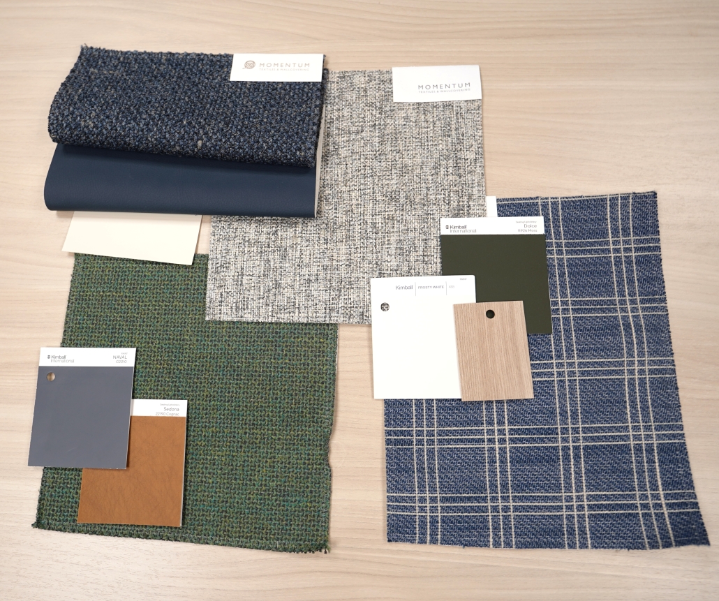
One of the biggest challenges is integrating brand colors without overwhelming employees. “They might love their blue and green brand colors but want the space to feel calm, so we choose softer shades or use accents like pillows instead of full-edge pieces,” says Emma.
This balance is important because while branding reinforces identity, comfort drives productivity. Designers often use subtle accents —like a pop of color or a statement art piece to maintain brand presence. Sydney said, “One tiny pop of color, a single piece of orange track completely set a project apart. It’s amazing how small details can make a big impact.”
These touches create balance between aesthetics and functionality, ensuring that the spaces feel inviting.
Colors for Collaboration and Focus
Different areas in the workplace serve different purposes, and color can support these functions. Collaboration is more vibrant, typically yellow, red, or a spin-off of a company’s branding, sometimes more controlled, sometimes more vibrant. For focus rooms, more subdued tones like soft green, soft blue, or lighter, more neutral colors.
This strategy leverages color psychology, bright hues stimulate energy and interaction, while muted tones reduce distraction and promote concentration. Even small adjustments like using vibrant fabrics in a lounge or calming tones in a private office can influence how people work and feel.
Emerging Trends in Workplace Color Design
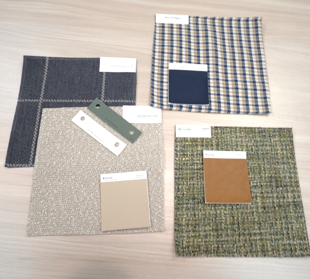
The color landscape is shifting. Gray, once a staple of corporate interiors, is moving to warmer, more organic tones. Emma says, “I feel like browns are coming back. We’ve seen gray, blue, and green for years. But now neutrals with soft tones and lots of texture are taking over.”
Sydney adds that muted pastels and biophilic palettes are on the rise, reflecting a broader movement toward wellness and sustainability. These trends align with post-pandemic priorities: creating spaces that feel natural, comforting, and adaptable. Expect to see earthy browns, soft greens, and textured neutrals dominating design in the coming years.
The Psychology Behind Color
- Red: Energy and excitement but can signal urgency or stress.
- Yellow: Joy and optimism, ideal for collaborative zones.
- Green: Calm and balance, perfect for meeting rooms and wellness spaces.
- Blue: Trust and stability, often used in corporate settings.
- Brown: Warmth and reliability, great for reception areas.
- Gray: Professionalism, best paired with brighter accents.
- White: Clean and minimal, often used as a neutral backdrop.
Color is a powerful tool for shaping workplace culture, employee engagement, and brand identity. From energizing collaboration zones to creating calm focus areas, thoughtful color choices influence how employees feel, interact, and work. Even the smallest detail can transform a space. In today’s landscape, investing in color strategy is investing in people, productivity, and brand integrity.


